Conventions of portraiture.
When taking a portrait of someone, there are always things to consider to ensure that a successful image is achieved. This is broken down into 4 sub sections as outlined by David Bate:
Face, pose, location and clothing. I am going to briefly explain what each of these points mean and give examples of photographers to demonstrate the points further.
The first convention I am going to look into is face, and why this is essential when taking a portrait of any kind. It is obvious that when taking a portrait of someone, their face usually needs to be seen because this lets the audience know who the photograph is of. It also allows the audience more insight into the meaning of the photograph if there is a meaning to be seen because the subject's expression can be captured which wouldn't be achieved if the face was out of view or obstructed in some way. "The expression on a face in portraiture is crucial and can exert a considerable impact on how a portrait signifies meaning" (Bate, D. Page 74).
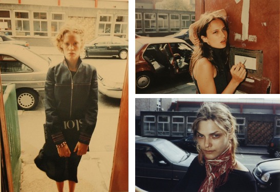
If we look at portraits of people, the face is the thing that interests the viewer initially or is where the eye goes to first. If we look at Juergen Teller's project "Go Sees", it is clear that face is very important within the project as the series of images are of hopeful models who turn up at his house.


FACE
The first convention I am going to look into is face, and why this is essential when taking a portrait of any kind. It is obvious that when taking a portrait of someone, their face usually needs to be seen because this lets the audience know who the photograph is of. It also allows the audience more insight into the meaning of the photograph if there is a meaning to be seen because the subject's expression can be captured which wouldn't be achieved if the face was out of view or obstructed in some way. "The expression on a face in portraiture is crucial and can exert a considerable impact on how a portrait signifies meaning" (Bate, D. Page 74).
If we look at portraits of people, the face is the thing that interests the viewer initially or is where the eye goes to first. If we look at Juergen Teller's project "Go Sees", it is clear that face is very important within the project as the series of images are of hopeful models who turn up at his house.

In these images, the model has turned up to Teller's house with the hopes of becoming a model and he has snapped them spontaneously which I think creates a very interesting project and also book. Each model presents a different expression, as they have been caught off guard by Teller taking a portrait of them. In 2 of the images, the models' expression is that of discomfort and shock as they did not expect their portrait to be taken so suddenly or didn't know what to do within the moment it happened. In the third portrait, the woman seems to have been more prepared as she has managed to pose herself in a way that seems staged and therefore works a lot more in her favour as a portrait shot. I think these images portray how important the face of the subject is within a portrait as they all show a different reaction and presented with each other creates a very interesting collection of photographs.
POSE
Pose is the next thing I am going to look at within the conventions of portraiture as, again, this is an important thing to think about when taking an image of someone. The pose of someone says a lot about them as a person in how they are choosing to present themselves to the camera and ultimately, the audience that the image is going to be shown to. Instantly, when looking at an image of someone, the audience 'reads' what they are seeing - they decide on what the mood of the photograph is and what they believe is trying to be portrayed. A pose can be a "self-consciously adopted manner intended to express a specific cultural 'identity'", so someone can portray themselves in a specific pose to demonstrate their identity more easily to the viewer.
If we look at the work of Laurence Philomène, within the aspect of challenging the industry with non-binary people, it is clear to see how the way these people pose affects the overall image and how they are viewed.
As can be seen in these images, each person is posed in a different way. In the first image, they are are seen to be looking down and away from the camera, which connotes a shy personality and this fits in with the i-D magazine article on how non-binary people are not represented as much as they should be within the media. In the second image, the person is seen to be looking at the camera, whilst playfully biting on a flower. I feel like this portrays confidence because of how direct it is, but also looks really fun because of how they are smiling. The third image is very different to the other 2 because of the way they are looking into the camera on a side, giving a rebellious and edgy vibe - the makeup also adds to the image as it reveals more about their personality as this is how they have chosen to present themselves. The final image I have used is the most different out of the 4 images because of the shot type that has been used - it has been taken from a lot further away and therefore more of the outfit can be seen, which shows their personality and style more to the audience. In this image they are posed in a crouched position, and the hands resting on their face gives the portrait a relaxed atmosphere.
LOCATION
The next section to cover is how important the location is in accordance to the portrait being successful in a particular way that portrays what the photographer wants to be seen. There are two places that photographers shoot in - in the studio or on location. In the studio, there is usually everything that is needed in one place - things such as lighting, lenses and any extra props needed like reflectors and grids for lights. On location, there is a lot more to consider - light is a lot more difficult to control, although additional lighting can be taken along to help with adding light to a photograph, and any props have to be organised to take because if they are forgotten they may not be easy to get to so the photographer will have to work with whatever they have.

Within this project (entitled 'Lumpen', which is roughly translated as 'social outcast'), photographer Sasha Mademuaselle tries to challenge the stereotype that Russian beauty has, by celebrating unique people from the smaller cities within the country. The use of the location within these image works really well because of how it shows the urban city the people live in which matches their style accordingly - if this was shot in a studio, the magic of the photographs would disappear and the images would have a completely different meaning.

These images are by Yanzhou Bao, and demonstrate how sometimes it is better to be in a studio than to be on location depending on what is being shot. The images on the left have worked a lot better in the studio because of how the light has been controlled really well to make the model look as perfect as possible which is what the client will have wanted. This looks as though it is a campaign or advertising shot and therefore the model would have to look good to promote the product, and the studio has worked really well here for this shot. It looks as though coloured gels have been used for the image on the right because of how there are two colours within the same image - this is a lot easier to achieve in the studio because the light can be controlled easily which is essential to get the balance of colour right for the image. Another factor that makes it look better in the studio is the fact the model is laying down; this may have been uncomfortable or awkward if shot on location whereas in a studio it will have been more comfortable and therefore the shot has worked.
CLOTHING
Clothing is a very important part of a portrait, as it often allows the audience to learn more about the person being photographed as it shows some of their personality within how they choose to portray themselves. This isn't always the case, though, because a lot of portraits taken can be taken for a brand to advertise something and therefore the clothing is not done for the model wearing it, but instead for the overall look of the image. Then, there is always the removal of clothing (for example a nude) that would come under this particular section, and the question of why this is done - is it for an erotic image or is there a deeper meaning to the portrait, eg. feminism.

In this project 'Colourtubs' by Francesco Vezzola, he has used a film camera to capture raw images of women bathing in water that have changed colour from an ingredient being added - for example, in this image, tomato juice was added to the water to give it the orange hue that it has. In relation to clothing, the woman can clearly be seen not to be wearing any clothes as her breasts are clearly visible - this adds to the image being very natural as people don't wear clothes in baths. This isn't done for any erotic reason, as I think the image is a slight reference to the objectification of women within the world that we live in as they are seen sexually very often. This image tries to challenge this idea by presenting a woman fully naked to the audience, in which the audience sees a woman nude but in a non-sexual way.

With this image, the brand have tried to advertise their perfume as looking very luxurious due to them wanting people to want to buy the product. To do this, they have used gold editing, which makes the image look luxurious due to gold being expensive and obviously used for jewellery, and the gold dress the model is wearing adds to this as she looks like she is rich and people may want to be like her so will buy the product.

From Richard Avedon's American West project, this image shows a boy holding a snake and the clothing plays a really important part to the image working within the project as it shows the type of person he is and what he does in his life. The overalls suggest that he has been painting or doing a labouring job of some sort as this is common for this job. I think this works really well as it fits with the project and if he was made to wear anything different, it wouldn't work as it wouldn't represent him.

Comments
Post a Comment