Posts

Showing posts from April, 2018

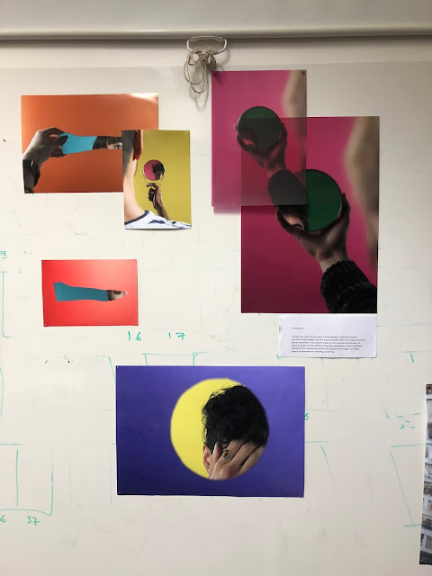
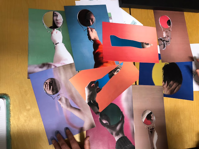
Finalising images for print.

Image
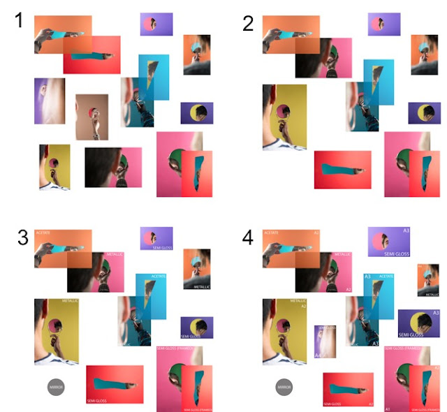
For this project I have done 12 shoots, and so I needed to narrow down which images I wanted to use for my final exhibition as I have shot hundreds of images - they can't all go up for my final show. I decided to do this shoot by shoot and narrow down which images were my favourite and worked the best, and then had to narrow these down again to get to a final few images. I am going to play about with the layout of my images on Photoshop as this is a free way of printing out different images at different sizes. I initially opened up a Photoshop document and set it to a square format to replicate a rough idea of what the exhibition space will look like. I then placed all of the images that I had edited as my finals onto the document to see if they all worked together in one space - this isn't the ideal way of deciding on a layout, but I don't have the time nor the funds to be printing the images out multiple times. I decided the images looked too cluttered and wasn

Final pin up session (with feedback).

Image
Today we had our last pin up session to get feedback from the people in our class - this has been really helpful in the past to allow me to see how I could improve my work for the exhibition. I decided on placing quite a few images on the wall because I think my project is a lot more effective when multiple images are placed together. Here is what I placed on the wall: It wasn't the best place to put work up on the walls as there was a lot of marks from where people had drawn on the board, so was a slight distraction I thought. I decided to place 3 different paper types on the wall to see if people thought they worked well together: acetate, semi gloss and metallic. I also placed some images on top of others to reflect the meaning of the project and to give it more depth. We then were placed into groups and had to answer some questions about people's work: 1) Can you name the theme? 2) How do the images relate to the theme? 3) Is the choice of scale, sequence or

Tim Brown - website review.

Image
We received an email on Wednesday to say that Tim had agreed to review some of our websites, and so I replied with my website because I really want to ensure that it is one that people enjoy looking at when they click onto it. I sent Tim a link to my website, but told him that it wasn't finished yet as I needed to post more of my work and also purchase a domain. This is the response I received: Tim's feedback has been really positive and he has mentioned some small aspects of my website that he thinks needs a change, but I am overall extremely pleased with the feedback I have received. He has mentioned things that I already thought needed to be changed, and so I now have a definite answer of whether these things needs altering.

Conor, "Between Sets" @ Hyde Park Book Club.

Image
A few friends and I decided to go along to Leeds to support Conor, who was exhibiting his work at Hyde Park Book Club. Conor was showing the work he has been creating for his FMP, and it was really cool to see one of my friends showing their work to people that aren't on our course, but have actually chosen to go to view some art. This is what Conor had placed on the wall: Some other artists also had their work on show and it was all so bright, colourful and really intrigued me: It was really interesting to see all different types of art in one room as I normally only see photography. There was graphics, poetry and textiles at this event too. As it was more of an event than an exhibition, there was also some live music which really added to the atmosphere, and complimented Conor's project really well:

Paper types research: update.

Image
As I had ordered a print from Print Space on a metallic paper, I thought it would make sense to try out my other ideas for paper types to then get more of an idea of which papers work best and then be able to go from there. The order from Print Space only took about 2 or 3 days to arrive which I thought was really good service, and this is what I received: I am really happy with this print because I think the metallic aspect of it is really subtle but is definitely visible - the image is also really good quality so this company is one I know is trustworthy - next I need to speak to Richard or Liam about whether or not they think the print works or not and then go from there. I also got an image printed straight onto 3mm mountboard - this was not something I intended to do but Conor wanted to do a test print and didn't want to pay the full price, so we halved the cost. I was  interested to see what my print looked like on this paper type, and I have included an image of i

APHE submission

Image
I received an email from Liam today to see I had been chosen by Richard to enter for the APHE Bursary, and I was really excited for this as only me and 4 other people on my course had been chosen for this. This is the email I received outlining what I had to do and, because it has to be in for Wednesday, I quickly got onto it and replied as soon as I could - I didn't want to miss this opportunity: This is what I sent to Richard so that he could send it over to the people that needed it: I chose some images that I hadn't quite refined just yet, because I wanted to get it sent as soon as possible so that I couldn't forget about it. I am happy with the images I sent across because they really reflect my project effectively.

BJP - Portrait of Britain submission.

Image
Why enter: Prizes: This competition cost £10 to enter for 1 picture - I've never paid to enter a competition before but I felt like this was worth the cost because of the high regard the British Journal of Photography has. This is the image that I entered for this competition:

Meeting with Laura Bird.

This morning I had a meeting with Laura, as I thought that her CV workshop last week was really helpful and so I wanted to go and speak to her about my options after university. I am near the end of my degree and so need to know what I am going to do next. She mentioned that there was a Huddersfield graduate programme that they do, which is an 8-12 week placement and is paid. She told me to simply search for internships and see what's available, and to start applying for things that interest me. I said I was looking at doing an internship and so this is what we looked at in the session - we didn't specifically look for photography ones as this was too narrow. We looked at fashion internships too and, because the companies are quite small, I would actually be doing something helpful and not simply being asked to do the jobs that no one else wants to do. Research websites of placements - do your research and actually show an interest in the company. One place she said to l

Reorganising my website.

Image
I created my website a year ago, and I initially posted a lot of my work on there to get me started. It looked quite basic at first, but I tried to make it look better over the summer. I decided to completely reorganise my full website to make it look a lot better and to look more inviting to people who come onto the website. On the homepage, I had an image of car lights created with a long exposure as I felt like this was quite generic and was okay to have on the 'entry' page. I felt like this was not something that best represented me at all, and so decided to place 3 portraits in place of that because shooting with people is something that I love to do; I would say this is the area I am most interested in. Here is the new and improved home page of my website: I love how minimal it is - it gets the point across without being too complicated. I have also included the 4 social media links in the top left corner because then people can see how I use these if they want to.

CV workshop.

Today Laura Bird came in to talk to us about making an effective CV, and I was excited to go to this talk because a CV is a vital part in getting into the career that you want. I am going to write out the different bits of advice that Laura gave us, as I can come back to this when I want to change my CV and see what needs to be done. Crafting and utilising an effective CV - L3 Photography. A CV is different dependant on what you are applying for - you have to change it up to meet the specific job you are wanting to get. Always include a personal profile in your CV - this is an optional thing but is worth it, as it is what an employer would read first. She then asked a question - How would you use a CV? Responses: For a job. For an agency. To ask about opportunities/ As part of website/portfolio. Additional document to application form. More advice: Make sure CV is tailored. Add academic projects and technical skills. Add relevant work experience and key achievements.

Fashion collaboration with Kelsey.

Image
We had a meet up with some fashion students so that they could talk through their ideas for their final major project, and could then find photographers who were interested in what it is they were wanting to do. One of the students, Kelsey (who I have worked with before), was there and said that her idea was really simple - she wanted to do a shoot in a hotel in most likely Leeds. Her keywords were location, hotel, bright, poppy. I then contacted her after the meeting as she left during it, and said that I was interested but wanted some more information about it. She sent across a mood board, and also advised me to look on the website of the brand she was using as inspiration: Chloe was also interested and, because Kelsey wanted to shoot with 2 models, we felt it would work really well to have 2 people on the shoot rather than just the one. We created a group chat and then went from there with the organisation of the shoot - we shot in a hotel in Leeds from 11am to aroun

Portfolio Review - Keeley Stone.

Image
I had the opportunity to have my project reviewed by Keeley also today, who I must say was so welcoming to everyone and really listened to what we had to say. She had a genuine interest in my project and asked me questions, gave me advice and also had some suggestions of her own for what I could do for my final exhibition: Would look good as a collage - Colours/shapes/Photoshop collage --> Kodak paper? She described it as 'not perfect' and added that it had quirkiness to it. It doesn't need unity. Add more contrast/saturation to the images. Great concept. Collage would give it more interest, and would make it stronger. Could print out all images on one piece of paper - have it sliding down the wall. Hang it? Don't have it regimented. Love the overlaying idea. All images reference one another. Use small images to give idea of what it looks like. I took in one image from each shoot which I was happy with and was more refined - most of them were from more

BIPP talk and competition.

Image
Today we had the opportunity to listen to BIPP member Bryn Griffiths talk to us about his practice and to show us some images that he has taken over the years - he has 35 years experience in this field and therefore I knew it would be interesting to see how he has got to where he is now. He has won awards for his photography, which I will go further into later on in this post. He started off by showing us an image of a car and asked how many images had made that image possible. A lot of people made guesses, ranging from 2 to around 15 - the answer was, in fact, 74 and I was really shocked at how one image of a car could be made up of so many images. He stated that at age 15, he was either considering doing accountancy or photography and did some work experience at somewhere called Big Shots. He clearly decided that photography was the route he wanted to take and it is clear from his images that he is passionate about what he does. He mentioned colour zoning, which is where you ma

Ideas for final exhibition.

For my final exhibition, I want to be as creative as possible within the ways I display my work - I want to my images to be different sizes, at different heights, at different depths and possibly even a variety of different paper types. This is all to be confirmed at a bit of a later date as I test out different ideas and paper types to see which ones work and with which others. I already know that semi gloss prints that I have had printed at the print bureau at university has worked really well because of how they have a slight shine, but not too much. I have already ordered to be printed onto a metallic paper type from www.theprintspace.co.uk/ , but am also interested in what it would be like to have some images printed onto acetate - this is a clear paper alternative which would be very effective for my project and would add depth to my work. As my project title is "Translucency", which means allowing light to pass through but not being clearly visible, this paper type w

Paper types research.

Image
One suggestion that keeps being given to me is to print onto a mirror and so I thought I would research into this a little more to see if this is something I could do or if it is not a viable option. I couldn't find anywhere that prints directly onto mirrors, so I also looked at printing onto metallic surfaces. This is because mirrors are a metallic object, and so I wanted to just to see the different options available: The website  https://www.my-picture.co.uk/  provides the service of printing onto aluminium, as can be seen below: This is their price list: My only issue with printing with a website I have not heard of before is that the quality may not be very good as they may be more of a business that sells to the public and therefore the quality just needs to be good enough for families and the like - not professional photographers. https://www.hellocanvas.co.uk : After looking at these websites, I decided to look at the paper types that other compa