Posts

Showing posts from March, 2018

Working with Muna from J'Adore.

Image
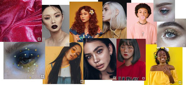
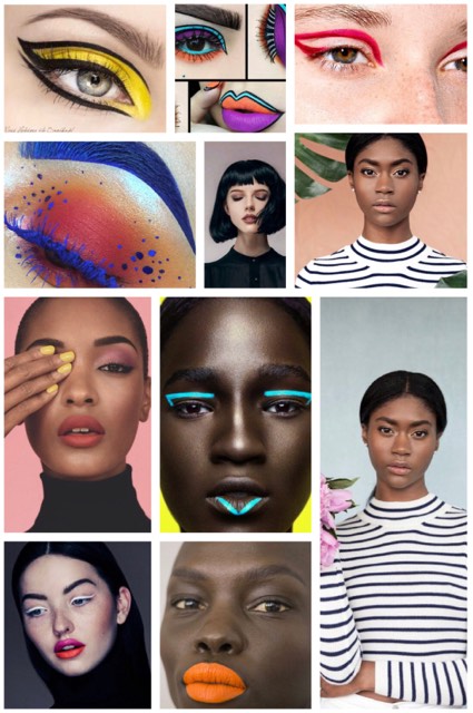
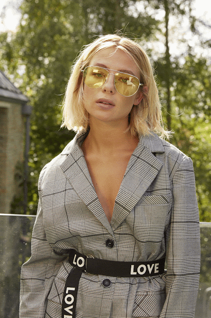
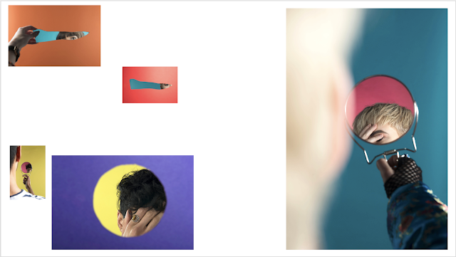
As stated in my previous blog post, I wanted to use the Easter break to take some images of my own, which are nothing to do with my FMP. I had messaged some models and emailed J'Adore and they said they had some models available to come to Huddersfield for the day I had planned the shoot and so I decided on working with Muna. This was a really big deal for me as I had never worked with a model directly from an agency and so I was super excited for this. The idea behind the shoot was using brightly coloured backgrounds and bright clothing to create really eyecatching imagery - with a glitter eye look to top it off, as can be seen in the moodboard I created here: Here are some gifs I created to show the before and after of my editing of Muna's skin - I feel like I have become a lot more confident in this area as I barely used to retouch my images but now I can see what a huge difference the editing can make: Here are some images from this shoot: I

Twelfth shoot back at university.

Image
I initially didn't have this shoot planned, but decided to take some images for my final major project because I had the studio booked for the full day and ended up finishing an earlier shoot quicker than planned. I had done a fashion shoot earlier on in the day and, because the model said she had seen images from my project on Instagram, I decided to used the remaining time to get some new images for my project. I am really happy that I did this, because I have a lot more images to play around with now and therefore have a wider range of photographs to narrow down. I decided to do everything that I had done previously in my shoots and also do one thing new, which was use one of the mirrors without its handle so that it was just a circle shape. I also decided on using another mirror that was a really strange shape because of how interesting it looked, and experimented with cutting out multiple shapes on one piece of card to shoot through. Contact sheet from this shoot:

Shoot with Natalie.

Image
As I have not done many shoots that have been purely for myself as I have been focussing on my Final Major Project, I wanted to use the Easter break to do some more shoots that I planned myself or collaborated with other people to add to my portfolio. This was the first shoot of the Easter break that I did, and I found Natalie through a Facebook page where I asked if anyone would be interested in doing a shoot with me. This was the moodboard I created for this shoot: I wanted to create a really bright makeup look, with the contrast of black and white outfits. The idea was to have full white outfits on a black background and then black outfits on a white background, which we did and I am really happy with the outcome of this shoot. I worked with Alexandra who does fashion communication and promotion at Huddersfield, and Natalie who did the makeup - I have worked with these 2 previously so I knew it would be easy to get the shoot done. Here are some of the images I took:

Sophie Abbott - Retouching.

Image
Today we were able to go to a retouching lesson with Sophie Abbott who is a retoucher for Boohoo, and I had signed up to it as soon as I saw the opportunity as I knew it would be beneficial to me as fashion is the industry which really interests me. The following are before and after gifs to show what I had done to each image. This image hasn't been perfected as the lesson was quite quick so I had to slightly rush - the aim was to make the model's arms less hairy which I have succeeded in, but the aftermath is not what I intended as the arm doesn't look realistic. I really enjoyed this session with Sophie, as it has highlighted key areas that she looks at when editing images for such a large company. I have also learned different ways to edit things that I previously edited in another way - this has been really helpful because it means that, if I am trying to edit a picture but the way I am using is not working, I can look at it another way and try to edit it

Third interim exhibition (with feedback).

Image
As we were coming up to our third interim show, I had to decide on which images were the most suitable for showing. For this, I created a layout on PowerPoint so that I could get more of an idea of how I wanted to display my images. I chose all of the images that I felt worked well for my project, and then narrowed it down to 5 final images for print: I decided that having one image a lot larger than the other images on the floor would work really well because of how it looks unorganised and therefore represents the unknown and also shows disruption - this works especially well for my project because it is about obstruction. The audience sees the images in a slightly chaotic manner and then tries to understand the work as individual pieces, which then again causes confusion and frustration at not being able to see the full person within an image. For this interim, I wanted each image to look completely different to the ones they were placed with, so removed the border

Product photography.

Image
As we had a lesson with Laura recently in which she had shot a really simple product, I wanted to have a go at some product photography so that I could add this to my portfolio - I only really have portraiture work currently and so want to open it up a little bit. I booked out the studio, and used a watch as my subject. From helping Josh in the studio, I decided being creative with some fishing wire would look really cool, so hung up some playing cards in the background. I then added a red background into my image to match the diamonds and hearts of the cards as I had used a black watch which matches with the clubs and spades. It was quite difficult to set this up as the fishing wire was really fiddly to hang the cards on, but using blu tac I was able to hang them in a way so that they would stop spinning around. The final image from this shoot is below: I am really happy with the outcome of this image because I think I have lit it really well and have managed to make it lo

Feedback (15/03).

Image
Today I showed Stella the progress I had made on my work and the developments I had made to get to the stage I am now at - I was really intrigued to see what she thought about my project because she hadn't seen it since the very early stages of the project. I showed the same images that I had shown the previous week to Richard and Yan to receive feedback from a different viewpoint. She stated that she felt like the images which I had shot through card were very Photoshop-like, which I thought was very interesting as it shows how I have created imagery that could be confusing to the audience because of how it isn't clear how it has been made. She also gave me the idea of using the card that I have used for these images in my exhibition which is something that I hadn't thought of but could do, as I have kept the card in case I wanted to reuse them. Two words that I said describe my project are conceal and reveal, which she said she could understand from these images - they

Feedback 9th March.

Today I had the opportunity to show my work to my teachers and classmates to receive feedback on my final major project, and I was really excited to show it because I felt like I had really developed it and that it had progressed a lot since the last time showing it. I showed a print of each edited picture that I had created in my most recent shoot, and laid each one on the table so that everyone could see them all together - including myself. It was really helpful to see all of these images together in one place because it allowed me to see whether the prints were working together or not and allowed me to understand which images worked the best for my project when compared to every other image. Upon showing my images, Hayley stated that she was unsure which images were using mirrors and which ones weren't. This comment instantly made me happy because it made me feel as though I was achieving my intentions for my project of not being able to tell which pictures are reflections an

Lesson with Laura Patrick.

Image
So today Laura came in to talk to us all about using Capture One as she is really experienced with the software, and this is what studios use more often rather than Lightroom which I had been using throughout my first 2 years of university. I have been trying to use Capture One as much as I can, but knew that having this lesson would be really helpful as I feel I am a beginner at using the software. First off, Laura compared Capture One to Lightroom: -More efficient. -More professional. -Better for workflow. -Can edit in Capture One. -Can draw on to remember later. Some benefits of using Capture One: -Tells you the focus point. -Exposure warnings. -Gridlines; great for product. Could use for my mirror images to make sure I'm consistent. -Overlay; can see how image would work with text/borders. Great for when lots of images need to be shot similarly, as seen below. -Can compare images to a specific one. -Colour editor; advanced. Can change colour easily. -Can edit

Eleventh shoot back at university.

Image
In this shoot, I decided to do a variety of different things to really make the most out of the time I had and to experiment with different shapes. For this, I used 2 different pieces of card and cut different shapes: I cut a triangular shape out of the blue piece of card, and cut out a circle in the yellow card which I did to relate to the mirror that I had used in most of my shoots. Contact sheet from this shoot: My images: In my last shoot, I straight away knew that the lighting on the card was something that I wanted to correct because there was a clear gradient that I had created within the way I had used the lights. This has definitely improved within this shoot because the colour is a lot more even on the card, however I think for my next shoot I would want the card to be a much brighter colour than I have achieved here; I think the colours that I have achieved still look good but they could look slightly better - it's not something that absolutely needs

Instagram inspiration from a YouTube video.

Image
Upon watching a video by Mango Street on YouTube ( https://www.youtube.com/watch?v=ubOyeNTcQsM&t=0s ), I found the following artist on Instagram. They do a shoutout at the end of their videos to show people's photography, and so I decided to have a look at their page to see what other kind of imagery they shoot. This is a screenshot from their video. After looking at their Instagram page, I was really loving the type of imagery they shoot because of their interesting use of colour and also I thought the layout of their Instagram profile worked really well. They really think out how each post is going to look and there is consistency in this as there is no image that feels as though it doesn't fit. The following are the images that interested me the most on their profile: The first set of images interested me because of obvious reasons - they focus on broken mirrors and the reflection of a portrait. I also really like how he has posted the imag

Tabitha Soren - Surface Tension.

Image
I really like this project because of how different it is to anything that I normally see - it is a project based on human interaction with technology and how people leave their imprint on the things that they use. Tabitha has the following statement about this project on her website: This unusual way of communicating interaction between man and technology is really interesting to me because of how it is something that happens to me within my daily life - I am constantly wiping my phone screen to make it look presentable and therefore feel like this project is very relatable. Here are some examples of Soren's work from her "Surface Tension" project: As this project looks upon things that go unnoticed (the marks left behind by fingers), I feel like my project loosely relates to it as I am trying to focus on specific parts of a person's face to hide other aspects for one reason or another.

Portfolio Reviews.

Image
Today we had the opportunity to have our work looked at by some reviewers, and I was excited to see what they had to say about my Final Major Project. I chose to talk with Silvana Trevale and Laura Patrick because I felt that these 2 were the most relevant to the work that I make. Initially I showed Silvana the work that I had created for my Final Major Project, as she had not seen the graduation of the work and so therefore could give an outsider's perspective. I also showed her the layout that I had done for my most recent Interim exhibition so she could understand the project in more depth. FMP: Ambiguous. Silvana said that she liked the layout that I created for my Interim Exhibition. Hand is always there - in the majority of the images I showed, a hand was present; deliberate? People show what they want to show. Image from very first shoot is aesthetically pleasing - orange and blue are complimentary. Experiment with body parts? Look at Layla Sailor's wor