Finalising images for print.
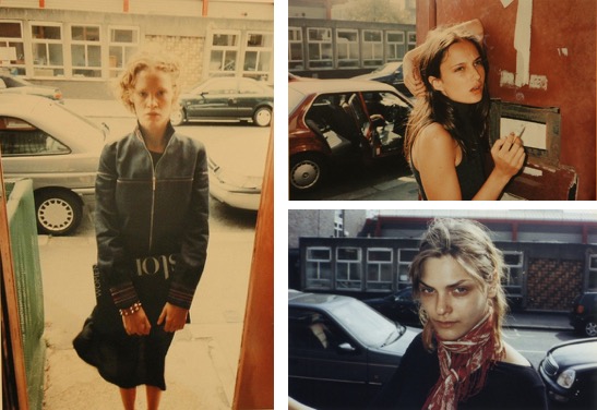
For this project I have done 12 shoots, and so I needed to narrow down which images I wanted to use for my final exhibition as I have shot hundreds of images - they can't all go up for my final show. I decided to do this shoot by shoot and narrow down which images were my favourite and worked the best, and then had to narrow these down again to get to a final few images. I am going to play about with the layout of my images on Photoshop as this is a free way of printing out different images at different sizes.
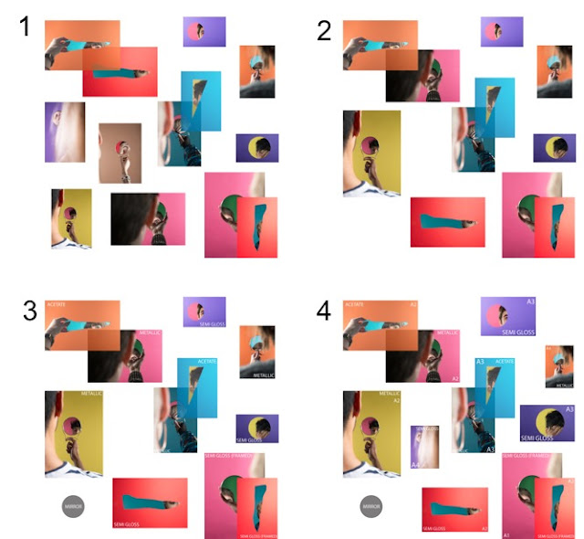


I initially opened up a Photoshop document and set it to a square format to replicate a rough idea of what the exhibition space will look like. I then placed all of the images that I had edited as my finals onto the document to see if they all worked together in one space - this isn't the ideal way of deciding on a layout, but I don't have the time nor the funds to be printing the images out multiple times.
I decided the images looked too cluttered and wasn't working, so I removed 2 of the images and made one bigger to fill the space a bit more. I think the layout in number 2 looks a lot better as it is more considered and doesn't look like I have tried to throw everything in at once to just fill spaces. The third image is to illustrate what paper types I am going to be printing the images onto, and have also included that I am going to be using a mirror as part of my installation. I wanted to include a mirror because this is where this project started and has progressed from, and I want to include the viewer as much as possible into the exhibition. I am going to be using the mirror I have continuously used in my project - the one that I started with at the very beginning of my project and ended with - and, even though it is small, I think it will work effectively with my installation because it makes the viewer get really close and personal with the piece. As can be seen in number 4, I decided to change the sizes of some prints because I felt like this was a more effective use of space, and then also I have added back in one of the images I had removed to fill in a little bit of space and to also make it look more equal as there was only one a4 print originally. Print wise, I have changed one of the images from metallic to semi gloss because of it being more cost effective.
These are all of my final prints:


Comments
Post a Comment