Reorganising my website.
I created my website a year ago, and I initially posted a lot of my work on there to get me started. It looked quite basic at first, but I tried to make it look better over the summer. I decided to completely reorganise my full website to make it look a lot better and to look more inviting to people who come onto the website.
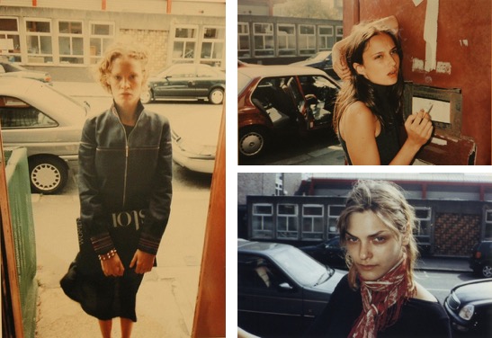
On the homepage, I had an image of car lights created with a long exposure as I felt like this was quite generic and was okay to have on the 'entry' page. I felt like this was not something that best represented me at all, and so decided to place 3 portraits in place of that because shooting with people is something that I love to do; I would say this is the area I am most interested in. Here is the new and improved home page of my website:


On the homepage, I had an image of car lights created with a long exposure as I felt like this was quite generic and was okay to have on the 'entry' page. I felt like this was not something that best represented me at all, and so decided to place 3 portraits in place of that because shooting with people is something that I love to do; I would say this is the area I am most interested in. Here is the new and improved home page of my website:

I love how minimal it is - it gets the point across without being too complicated. I have also included the 4 social media links in the top left corner because then people can see how I use these if they want to.
I then decided to organise my projects from university into their own pages, and also categorised my location and studio work:

And then when you click on the main sidebar, this is how the website loads up:

On my contact page I had an image of a car's wing mirror that I had taken at college but, when looking at it properly, I realised that it didn't look good as it was really dark and didn't reflect the level that I am at. Below is the new and improved contact page:

I am really happy with the new layout of my website, as I think it looks so much better than it did previously. I was really unhappy with how my website looked beforehand and this put me off updating it at all - this meant that my work was not very up to date and so, if anyone had looked at my website, they were seeing old work.
The next steps for me are to upload all of my recent shoots - I have done quite a lot of shoots that are not on my website at all and I have also done more work for my FMP that needs to be uploaded, and I also need to buy a domain. A domain for a website looks so much more professional than my website address now because it is really simple and easy to find; this is one of my priorities now because I will be graduating soon and so I need to have a website that people can look at that I am proud of.

Comments
Post a Comment