Colour Theory
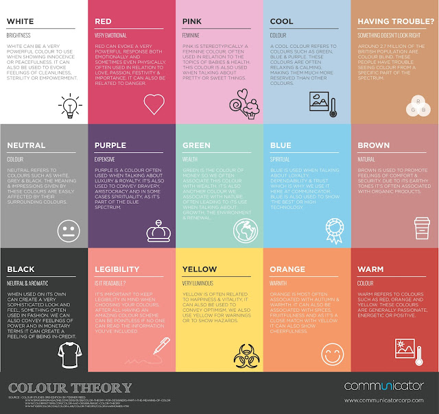
Within my images, I am often using bright colours to try and create interesting visuals to engage the viewer in the work. Initially, I have used any colours that I think work well together and have not thought too much about why I am using them, but am considering looking into the use of colour more to help develop my work and give it more meaning. For example, if the colour red instantly signifies danger in any situation, this is a colour I would perhaps stay away from as this isn't the type of imagery I want to be creating.
Here are some things for me to consider:
Here are some things for me to consider:


Comments
Post a Comment