Feedback (15/03).
Today I showed Stella the progress I had made on my work and the developments I had made to get to the stage I am now at - I was really intrigued to see what she thought about my project because she hadn't seen it since the very early stages of the project. I showed the same images that I had shown the previous week to Richard and Yan to receive feedback from a different viewpoint.
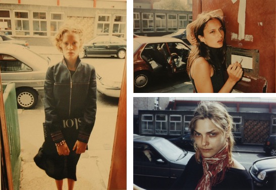
She stated that she felt like the images which I had shot through card were very Photoshop-like, which I thought was very interesting as it shows how I have created imagery that could be confusing to the audience because of how it isn't clear how it has been made.
She also gave me the idea of using the card that I have used for these images in my exhibition which is something that I hadn't thought of but could do, as I have kept the card in case I wanted to reuse them.
Two words that I said describe my project are conceal and reveal, which she said she could understand from these images - they make the audience question how the image has been created because of the combination of cut out shapes and mirrors. This makes the audience intrigued and therefore they spend more time with it.
She suggested that I could stick with a few colours to help keep the project consistent and she mentioned using primary colours within each portrait. I feel like this would restrict my project and would create too much cohesion - I want there to be a correlation between the shapes and the materials I am using, but want there to be some unknown within the project. Using a variety of colours helps add to the confusion of the project and also keeps the fun, bright and poppy vibe that I am aiming for within my portraits.
Some artists that she suggested to look more in depth at were the following:
Lucas Blalock
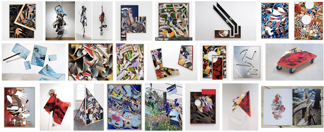
Kate Steciw
Charlotte Cotton - Photography Is Magic
Hannah Whitaker
Daniel Gordon
Owen Kydd
Matt Lipps.
Here are a list of the artists out of this list that I found the most interesting:
Kate Steciw:
The way Kate displays her work is something that I find really interesting because there is never anything that is the same as the last - they are not exhibited in an ordinary way. I want to place my work in an unconventional way and so I think her work is going to be one that I will pay attention to.
Hannah Whitaker:
Within Hannah's work, she creates imagery that is very collage inspired. This makes me wonder about how I want to display my work and whether I want to include some of the cutouts I have used for my final show.
Owen Kydd:
This work has reinforced the idea of placing different images over one another in a way that hides images - this will really add another depth to my project as I am physically hiding the prints as well as hiding/revealing the subject within the print.
Matt Lipps:
As I have used pieces of card to shoot through in my more recent images, I am wondering whether or not to include these in my final exhibition show. I think the way Matt has combined different images together works really well, and I am definitely going to take this into consideration when creating my final exhibition.


Comments
Post a Comment