Third interim exhibition (with feedback).
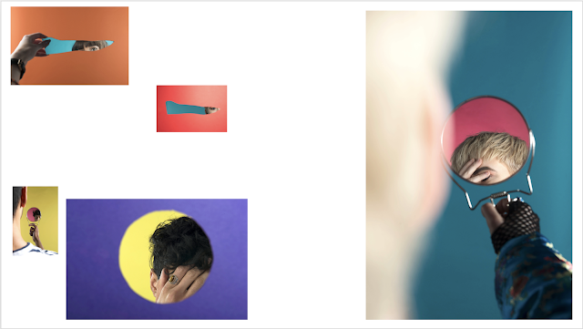
As we were coming up to our third interim show, I had to decide on which images were the most suitable for showing. For this, I created a layout on PowerPoint so that I could get more of an idea of how I wanted to display my images. I chose all of the images that I felt worked well for my project, and then narrowed it down to 5 final images for print:
I decided that having one image a lot larger than the other images on the floor would work really well because of how it looks unorganised and therefore represents the unknown and also shows disruption - this works especially well for my project because it is about obstruction. The audience sees the images in a slightly chaotic manner and then tries to understand the work as individual pieces, which then again causes confusion and frustration at not being able to see the full person within an image.
For this interim, I wanted each image to look completely different to the ones they were placed with, so removed the border using a trimmer to give each print a clean finish.
This is the final layout I used for my final interim exhibition before the actual end of year exhibition. I used my layout idea as a basis for the way I placed my images as I felt like this would really work for my project, and think this represents my idea of obstruction and the hidden/reveal concept of the images. Although I think this layout is very effective because of how each image does not line up with any of the others and I have used different sizes to demonstrate the hidden concept even further, I am confident that I can improve my work for the final exhibition show in June. I would have much preferred the image that is leaned against the board to be a lot larger, but did not realise how big the board would be compared with the size of the print. For my final exhibition I think I am going to think about my layout in depth and, if I was going to use the same images, I would print each image one size larger.
We were placed into groups and had to analyse the work people had put up onto the boards, and this was the feedback I received on the following questions:
This is the feedback that I received:
What is on show?
1. Body image, insecurity.
2. Artist statement is accurate, maybe too literal - allow room for other people.
3. Different sizes, levels work.
4. Fun. Print at bottom works. Correct paper type. Try a mix of papers
5. Arrangement works well. Amount works well.
What can be done next?
1. As big as one at bottom, mixture of sizes interesting if you added mirrors on the wall next to it. Could stick image on mirror?
2. Don't give everything away in statement. Leave space for people to wonder.
3. Good word, without title more intriguing.
4. Don't need book or portfolio.
5. Portfolio maybe?


Comments
Post a Comment