Posts

Fashion shoot with Marie and Deborah.
Image
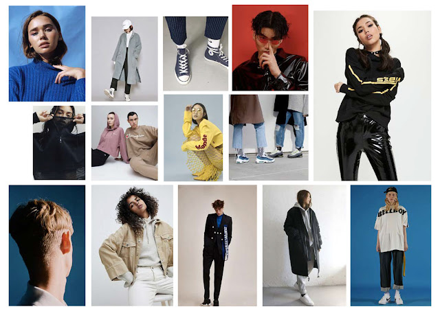
After having a meeting with the fashion students a few weeks ago, the day came upon us to shoot for 2 fashion students - they had planned to shoot 2 models in the same day in the studio. I knew this would be tricky to do because is often takes hours to do a shoot with just one model, but we tried it anyway and it ended up working really successfully. They both had very different ideas for their photoshoots as one student was looking at the brand Weekday and then the other was looking at the ways in which we should recycle clothes. This was Marie's moodboard, for the Weekday inspired shoot: Here is Deborah's moodboard, for the recycled clothes shoot: Here are some images from this shoot:

Buying a domain.

Image
Being someone in the creative industry, having a website is very important because it is enables you to showcase your work in any way that you want to. I already had a website that I was happy with but knew that having a really long and clunky URL would not look professional, so I bit the bullet and bought myself a domain - lewisstewart.co.uk . This is so much more professional as it shows that I am serious about my work and that I care about how I present myself.

Making a zine.

Image
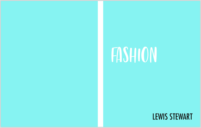
I spoke to Richard today about whether I should buy a portfolio box for the exhibition to show the fashion work I have been creating alongside my FMP, and he instead suggested making a zine to present this work instead. I really like this idea because it is an easy way for someone to look at my work in one go as they can simply flick through the book. This is how I intend to print it: For this, I have used Photoshop to select colours from the images themselves and use this colour to create a block page, which I think will work well as it will make the final piece look brighter and more engaging. I have chosen an icy blue colour for the front and back cover because I wanted to have a really stand out book that people would want to look at - I was choosing between this colour and a bright pink; I decided against pink because I know Conor's book has a pink cover and I don't want there to be competition between the 2. I experimented with a few other

Shopping around for an A1 frame.

Image
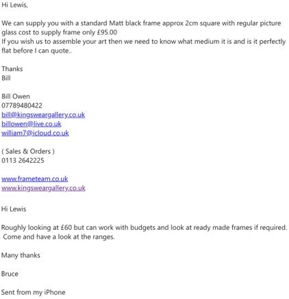
I have already bought a silver frame for my A2 print, to relate to the mirrors I have used within my project, and just need to find one for my A1 print. I have emailed a few places to see the types of prices they were quoting and then I went from there. I initially asked about black frame as this is what I thought I wanted: I received quite a few emails very quickly after asking about frames - they all seemed quite expensive (seeing as I have had to pay a lot for my prints and therefore don't have a lot of money to spend on framing them) and so I was wondering what to do. I then realised that black would look way too harsh for my prints because it would make them look darker and could create a totally different meaning to my project. I decided to instead go with white and so I emailed 'On The Wall' back and asked if they had any white frames, seeing as they had some really good prices: Unfortunately, they didn't have any A1 frames as can be seen in the re

Getting images mounted.

Image
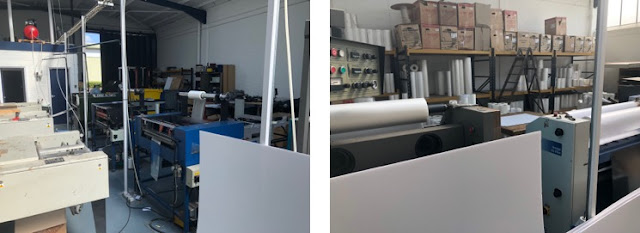
A few people on my course and I decided to go to Plastic Art in Leeds to get our final images mounted, and we drove down in 2 cars so that we could all get down there and also bring home the prints too. This is where we got them mounted: The people there were so friendly and really helpful and advised us about which mounting boards they had. I decided to go for PVC because I wanted my prints to be sturdy and really flat, and also opted for a gloss finish because I felt like this would be effective for my project as it would reflect light and therefore work well with the idea of the mirror. Here are my final prints - I am so super happy with how these turned out and I now cannot wait for the exhibition so that I can see them all together how I envision it.

Cult Artes zine feature.

Image
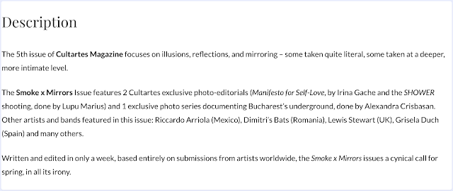
I submitted some images to the Cult Artes website because it was free and I felt like I had nothing to lose - either they would use the work or they wouldn't. I received an email not long after my submission to say that they liked my images and that I was going to be featured in their March issue. This made me so super excited because nothing like this has ever happened to me before - I feel like my work is being recognised and all my hard work is finally paying off. This magazine was also supposed to be printed but, unfortunately, I received an email a few days ago to say that they were having trouble with getting it printed because they are a small business and have to do everything themselves. This was really upsetting but I am still extremely happy that they included my work in their publication.

Finalising images for print.

Image
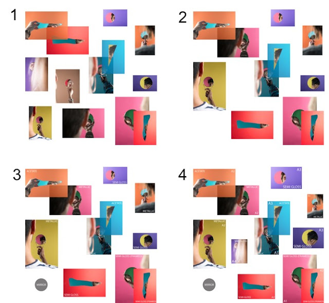
For this project I have done 12 shoots, and so I needed to narrow down which images I wanted to use for my final exhibition as I have shot hundreds of images - they can't all go up for my final show. I decided to do this shoot by shoot and narrow down which images were my favourite and worked the best, and then had to narrow these down again to get to a final few images. I am going to play about with the layout of my images on Photoshop as this is a free way of printing out different images at different sizes. I initially opened up a Photoshop document and set it to a square format to replicate a rough idea of what the exhibition space will look like. I then placed all of the images that I had edited as my finals onto the document to see if they all worked together in one space - this isn't the ideal way of deciding on a layout, but I don't have the time nor the funds to be printing the images out multiple times. I decided the images looked too cluttered and wasn